In the first guide, I got Claude Code to talk to Figma. In the second guide, I got it to build buttons with real token bindings. Both times I was building the design system myself, from scratch, with my own janky JSON files.
But here's the thing. In the real world, you don't usually build a design system from scratch. Someone already did. Your company has one. Or you found a nice one on Figma Community. It's sitting there, fully built, with proper variables and token naming and everything. You just need to... use it.
So I thought: what if I skip the building part entirely, take an existing Figma design system, feed it to Claude Code, and vibe code a real website that actually uses those tokens? Like a Medium-style blog landing page. Something you could actually deploy.
Spoiler: it works. But first you need to check if the design system is actually set up in a way Claude can understand. Not all of them are. And the difference between a Claude-friendly file and a Claude-hostile file is mostly just... naming things properly.
What we're actually building
By the end of this guide, you'll have a one-page blog landing page (think Medium, but simpler) that uses real design tokens from an existing Figma file. Not hardcoded colors. Not random spacing values. Actual var(--sds-color-background-brand-default) references that trace back to the Figma source of truth.
And then we'll deploy it. Like, to the internet. Where people can see it.
The design system we're using
I'm using the Simple Design System, a free, open-source community file on Figma. If you want to follow along with the exact same setup, duplicate it to your drafts. If the file feels too big, delete the components you don't need and keep a handful to test with. Buttons + a few inputs is enough.
You can also use your own design system file. Just make sure it passes the health check below. Otherwise Claude is going to have a bad time. And so will you.
Part 1: Is your design system vibe-coding friendly?
Before you feed a Figma file to Claude, you need to check if it's set up in a way Claude can actually read. Think of this as a health check for your design system.
This is the single biggest thing that determines whether Claude can work with your design system. When Claude reads a component through MCP, it sees the name. If the name is Frame 237, Claude has no idea what it's looking at. If the name is Variant=Primary, State=Default, Size=Medium, Claude immediately knows what to build.
Open your Figma file and look at how components are named. Here's what good vs. bad looks like:
Component names
✓ Claude-friendlyButton
Icon Button
Button Danger
✗ Claude-hostileCTA Element v2 final
Frame 237
Group 14 copy
Variant properties
✓ Claude-friendlyVariant=Primary
State=Hover
Size=Small
✗ Claude-hostileStyle Type=Main One
Interaction=Mouse Over It
Bigness=Regular
The Simple Design System names its button variants like this: Variant=Primary, State=Default, Size=Medium. That's basically already a React prop definition. Claude reads that and knows exactly what variant="primary" means in code.
✓ The rule is simple: If a developer could guess the component's code props from its Figma name, it's Claude-friendly.
Open the Variables panel in Figma. Look at how the tokens are named. You want semantic names, names that tell Claude what the token is for, not just what color it is.
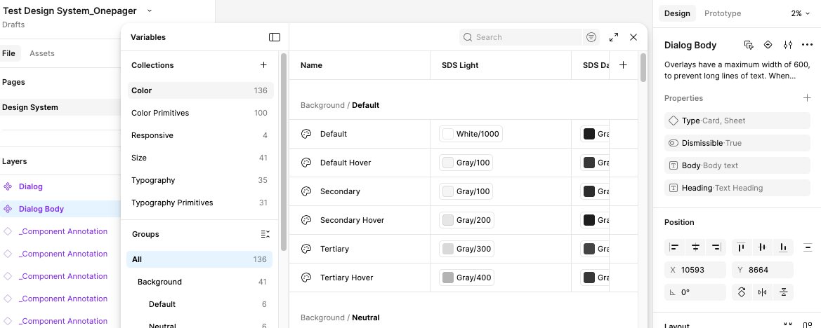
✓ Claude-friendly--sds-color-background-brand-default
--sds-color-text-brand-on-brand
--sds-size-space-300
--sds-size-radius-200
✗ Claude-hostile#3271d7 (hardcoded hex)
blue-500 (palette name only)
12 (magic number)
s (what does this even mean)
When Claude sees --sds-color-background-brand-default, it knows three things: it's a color, it's for backgrounds, and it's the default brand color. When it sees #3271d7, it knows nothing. It's just a blue.
If you want a deeper dive on how design tokens work (primitives vs. semantic, two-layer structure, Token Studio imports), I covered all of that in the previous guide.
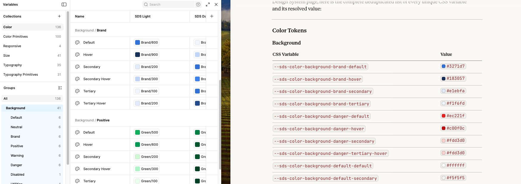
Here are the actual tokens from the Simple Design System:
--sds-color-background-brand-default: #3271d7
--sds-color-text-brand-on-brand: #f1f6fd
--sds-color-border-brand-default: #224a8a
--sds-size-space-200: 8px
--sds-size-space-300: 12px
--sds-size-radius-200: 8px
--sds-typography-body-font-family: Inter
--sds-typography-body-size-medium: 16px
💡 Where does the --sds- prefix come from? SDS stands for Simple Design System, a free, open-source Figma community file. The prefix comes from how the variable collections are named inside Figma, not from the file name. The MCP tool converts Figma's folder hierarchy into CSS custom property names automatically. If you use a different design system, the prefix will be different.
💡 Want the full deep-dive on tokens? My
previous guide covers how to create two-layer design tokens (primitive + semantic), import them into Figma via Token Studio, and bind them to components. If your file doesn't have tokens set up yet, start there first.
Two more things to glance at. These matter less than naming, but they still affect how cleanly Claude translates your design to code.
Auto layout
✓ Claude-friendlyAuto layout with token-based spacing
Claude translates to display: flex; gap: 8px;
✗ Claude-hostileFixed positioning, manual pixel nudging
Claude has to guess what the layout should be
Layer names
✓ Claude-friendlyContainer, Label, Icon/Leading
✗ Claude-hostileFrame 4, Vector 12, Text
✓ Passed all three checks? Your file is vibe-coding friendly. Let's move on.
Part 2: Extract your design system using MCP
Now we pull everything out of the Figma file and into a reference document that Claude can use while coding. We're using Claude's built-in Figma MCP connection to do this. No copying hex values by hand, no squinting at the Variables panel.
First, we need to know what's in the file. What components exist, what they're called, what variants they have. Claude's Figma MCP can read all of this from a single URL.
Open Claude.ai (not Claude Code, this uses Claude's built-in Figma MCP connector in the chat interface). Make sure your Figma account is connected under Settings. Then paste this:
ask claude to read the page structureRead the structure of this Figma page and list every component with all its variant names and node IDs:
{your Figma URL with node-id}
⚠ Where do I get the URL? Open your Figma file, navigate to the page with your components. The URL in your browser already has the node-id baked in. Just copy the whole thing. It looks like: https://www.figma.com/design/YOUR_FILE_KEY/Your-File-Name?node-id=123-456
Claude calls Figma's MCP and comes back with every component on the page, including every variant name and node ID:
Button (18 variants)
Variant=Primary, State=Default, Size=Medium
Variant=Primary, State=Hover, Size=Medium
Variant=Primary, State=Disabled, Size=Medium
Variant=Neutral, State=Default, Size=Medium
Variant=Subtle, State=Default, Size=Medium
Button Danger (12 variants)
Variant=Primary, State=Default, Size=Medium
Variant=Subtle, State=Default, Size=Medium
Icon Button (18 variants)
Button Group (5 variants)
Align=Justify, Align=Start, Align=End, Align=Center, Align=Stack
One prompt. Every component, every variant, every node ID. No clicking around Figma. The node IDs matter because we'll need them in the next step to read the tokens.
💡 Notice the variant names? Variant=Primary, State=Default, Size=Medium is basically already a React prop definition. This is what makes the file vibe-coding friendly. Claude reads these names and knows exactly what variant="primary" means in code.
💡 Tip: Combine everything into one page first
Most design system files spread components across multiple pages. Buttons on one, Inputs on another, Cards on a third. That means you'd need to repeat this step for every page, copying each URL individually.
The easier way: duplicate your Figma file and move all components onto a single page. That's what I did. One page means one URL, one prompt, and Claude reads everything at once. It takes 2 minutes of dragging in Figma and saves you a lot of back-and-forth.
If you combined everything onto one page (which I recommend), you can extract both the component names and all the tokens in a single prompt. No need to do them separately.
Copy the page URL from Figma and paste this into Claude:
extract everything from one pageRead this Figma page and give me two things:
1. COMPONENTS: List every component with all its variant names (e.g. "Button: Variant=Primary, State=Default, Size=Medium")
2. TOKENS: Find the section frame that contains all components and extract every design token (variable definition). List every unique CSS variable name and its value.
{your Figma URL with node-id}
Claude reads the page structure and the section frame, then returns both the component map and the full token list:
Button (18 variants)
Variant=Primary, State=Default, Size=Medium
Variant=Primary, State=Hover, Size=Medium
Variant=Primary, State=Disabled, Size=Medium
Variant=Neutral, State=Default, Size=Medium
Button Danger (12 variants)
Icon Button (18 variants)
Button Group (5 variants)
Align=Justify, Start, End, Center, Stack
--sds-color-background-brand-default: #3271d7
--sds-color-background-brand-hover: #183057
--sds-color-background-neutral-tertiary: #f3f3f3
--sds-color-background-neutral-tertiary-hover: #e3e3e3
--sds-color-background-neutral-secondary: #cdcdcd
--sds-color-background-danger-default: #ec221f
--sds-color-background-danger-hover: #c00f0c
--sds-color-background-danger-tertiary-hover: #fdd3d0
--sds-color-background-disabled-default: #d9d9d9
--sds-color-background-default-secondary: #f5f5f5
--sds-color-background-default-secondary-hover: #e6e6e6
--sds-color-background-default-default-hover: #f5f5f5
--sds-color-text-brand-on-brand: #f1f6fd
--sds-color-text-default-default: #1e1e1e
--sds-color-text-neutral-default: #303030
--sds-color-text-danger-on-danger: #fee9e7
--sds-color-text-danger-default: #900b09
--sds-color-text-disabled-on-disabled: #b3b3b3
--sds-color-border-brand-default: #224a8a
--sds-color-border-neutral-secondary: #767676
--sds-color-border-default-default: #d9d9d9
--sds-color-border-danger-default: #900b09
--sds-color-border-disabled-default: #b3b3b3
--sds-color-icon-brand-on-brand: #f1f6fd
--sds-color-icon-default-default: #1e1e1e
--sds-color-icon-disabled-on-disabled: #b3b3b3
--sds-size-space-100: 4
--sds-size-space-200: 8
--sds-size-space-300: 12
--sds-size-space-400: 16
--sds-size-radius-200: 8
--sds-size-radius-full: 9999
--sds-size-stroke-border: 1
--sds-typography-body-font-family: Inter
--sds-typography-body-size-medium: 16
--sds-typography-body-font-weight-regular: 400
One prompt. Every component and every token. That's the advantage of having everything on one page.
💡 Why does this get all tokens at once? MCP reads every child node inside the frame you point it at. A section frame contains all the component sets, which contain all the variants. So one read at the section level catches everything underneath.
⚠ Didn't merge into one page? You'll need to paste each page's URL separately and run the same prompt for each. Then ask Claude to merge and deduplicate the results.
Claude already has all the data. Now ask it to compile everything into a single reference file:
ask claude to compile the referenceBased on everything you just extracted from the Figma file, write me a CLAUDE.md file that includes:
1. A rule at the top saying "Use these design tokens for ALL styling. Never hardcode colors, font sizes, or spacing values."
2. Every unique token organized by category (colors, spacing, radius, typography, border)
3. Every component with its variant properties, sizes, and states
4. The Figma source URL
Format it as clean markdown.
Save Claude's output as CLAUDE.md in your project folder's root.
Why CLAUDE.md and not something else?
CLAUDE.md is a special file in Claude Code. When you open Claude Code in a project folder, it automatically reads CLAUDE.md at the start of every session. You never have to say "read the design system file." Claude just knows your tokens the moment you start talking to it.
This is different from a regular file like DESIGN_SYSTEM.md or skills.md:
CLAUDE.md
Auto-loaded every session. Claude Code reads this file automatically when you start it in the project folder. No prompting needed.
Best for: project-wide rules that should always apply. Like "use these tokens for everything."
skills.md / other files
Not auto-loaded. Claude only reads these if you explicitly ask it to. You'd need to say "read skills.md" every time you start a session.
Best for: optional references, one-off tasks, things you don't need in every conversation.
For design tokens, you want CLAUDE.md. Your tokens should be loaded in every conversation, not just when you remember to ask. You open Claude Code, you start describing what you want, and it already knows to use var(--sds-color-background-brand-default) instead of making up #random-blue.
Here's roughly what the file looks like:
Use these design tokens for ALL styling decisions.
Never hardcode hex colors, pixel font sizes, or spacing values.
Every color, spacing, radius, font size, and font weight
must reference a token from this file using var().
--sds-color-background-brand-default: #3271d7
--sds-color-background-brand-hover: #183057
--sds-color-background-neutral-tertiary: #f3f3f3
--sds-color-background-danger-default: #ec221f
--sds-color-background-disabled-default: #d9d9d9
--sds-color-text-brand-on-brand: #f1f6fd
--sds-color-text-default-default: #1e1e1e
--sds-color-text-neutral-default: #303030
--sds-color-text-danger-on-danger: #fee9e7
--sds-color-text-disabled-on-disabled: #b3b3b3
--sds-color-border-brand-default: #224a8a
--sds-color-border-neutral-secondary: #767676
--sds-color-border-disabled-default: #b3b3b3
--sds-size-space-200: 8px
--sds-size-space-300: 12px
--sds-size-radius-200: 8px
--sds-size-stroke-border: 1px
--sds-typography-family-sans: Inter
--sds-typography-weight-regular: 400
--sds-typography-weight-bold: 700
--sds-typography-scale-04: 14px
--sds-typography-scale-05: 18px
--sds-typography-scale-06: 20px
--sds-typography-scale-07: 24px
--sds-typography-scale-08: 32px
--sds-typography-scale-09: 40px
--sds-typography-scale-10: 48px
Variants: Primary, Neutral, Subtle
Sizes: Medium (40px), Small (32px)
States: Default, Hover, Disabled
Variants: Primary, Subtle
Same sizing as Button
Variants: Primary, Neutral, Subtle
Sizes: Medium (44px), Small (36px)
Align: Justify, Start, End, Center, Stack
That's your complete design system reference, extracted entirely through MCP, saved in a file that Claude Code reads automatically.
💡 You only do this extraction once. Every time you open Claude Code in this project folder, it reads CLAUDE.md and already knows your entire design system. If the Figma file gets updated, re-run the MCP prompts and update the values.
✓ At this point you have: every component name, every variant, and every token. All extracted through MCP, saved in a file that auto-loads. Zero manual work per session.
Part 3: Vibe code a landing page
This is the fun part. You talk to Claude Code in plain English and build a Medium-style blog landing page using your design tokens.
💡 About the --sds- token names in these examples: The prompts below use token names from the Simple Design System (--sds-color-background-brand-default, etc.). If you're using a different design system, don't worry. Your CLAUDE.md already has your actual token names. When the prompt says "use the design tokens from CLAUDE.md," Claude will use whatever's in your file, not the --sds- names shown here.
Quick setup reminder before we start coding. If you followed Part 1, you already have all of this. If not, here's what you need running:
✓ Terminal open – macOS Terminal, iTerm, Windows Terminal, whatever you use
✓ Node.js installed – run node -v to check. Need v18+
✓ Claude Code installed – run claude to check. If not installed: npm install -g @anthropic-ai/claude-code
✓ Logged in – Claude Code will prompt you to log in the first time. You need a Pro or Team plan
First, create your project folder:
create the project foldermkdir blog-landing
cd blog-landing
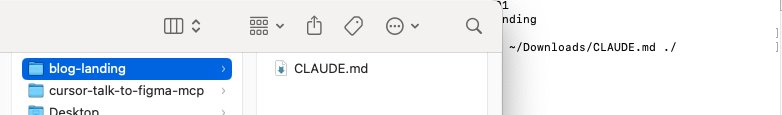
Now move the CLAUDE.md file you downloaded from Claude.ai into this folder:
move the downloaded filemv ~/Downloads/CLAUDE.md ./
Start Claude Code:
start claude codeclaude
Claude Code reads CLAUDE.md automatically when it starts. No need to say "read the design system file" or paste any context. It already knows your tokens, your components, and the rule to never hardcode values.
You can verify by asking something simple:
verify it loadedWhat color token should I use for a primary button background?
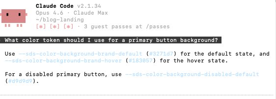
If Claude answers --sds-color-background-brand-default, you're good. If it makes up a token name, check that CLAUDE.md is in the project root.
✓ This is the payoff of CLAUDE.md. No setup prompt. No context pasting. You open Claude Code and your design system is already loaded. Every session. Automatically.
Now just... describe what you want. In English. This is vibe coding.
the main promptBuild me a one-page blog landing page, similar to Medium. Simple, clean, editorial. It should have:
1. A centered header with a site name and a "Subscribe" button using the Primary Button style
2. A hero section with a large headline using the Title Hero typography style and a subtitle using the Subtitle style
3. A grid of 3 blog post cards, each with a Heading for the title, Body for the excerpt, and a small author/date line
4. A footer with a "Back to top" Subtle button and some links
Use only the design tokens from CLAUDE.md for everything — colors, spacing, radius, AND typography. Use the typography scale tokens (--sds-typography-scale-XX) for font sizes and the weight tokens for font weights. Don't hardcode any font sizes or weights.
Create a single index.html file with embedded CSS. Define all --sds- custom properties in :root so the tokens work standalone. Make it responsive.
Then sit back and watch. Claude will generate an HTML file with your token references baked in. Every background-color will use var(--sds-color-background-brand-default). Every font-size will use var(--sds-typography-scale-10) instead of 48px. Every font-weight will reference var(--sds-typography-weight-bold) instead of 700. No hardcoded values anywhere.
Once Claude finishes, open it in your browser to see the result:
preview in browseropen index.html
💡 On macOS, open index.html opens it in your default browser. On Windows, use start index.html. On Linux, use xdg-open index.html. Keep the browser tab open and just refresh it after each iteration.
This is the "vibe" in vibe coding. You look at the result and describe what to change in plain English. No CSS knowledge required. Just vibes.
example iteration prompts"The cards feel too cramped. Add more spacing between them."
"The subscribe button doesn't look right. Use the Primary variant with rounded corners from the radius token."
"The headline should use Title Hero sizing (scale-10). It's too small right now."
"The card titles should use the Heading style, not the Body style."
"Add a thin border under the header using the border-default token."
Each time, Claude updates the code using your token names. Not new magic numbers. Not hardcoded values. Your tokens. That's the whole point. If you ever go back to Figma and change --sds-color-background-brand-default from blue to purple, you update the :root values and everything changes. One source of truth.
✓ When you're happy with how it looks: save the file and move on to deployment.
Part 4: Deploy it
You have a website. Let's put it on the internet.
It's a static HTML file. No build step. No framework. Just push it.
deploy to vercelnpm i -g vercel
vercel
Follow the prompts. Your site will be live in about 30 seconds.
✓ That's it. You took an existing Figma design system, extracted the tokens, fed them to Claude Code, vibe coded a landing page, and deployed it to the internet. All without writing CSS by hand.
🎉 Three for three.
First guide: Claude talks to Figma.
Second guide: Claude builds buttons with real tokens.
Third guide: Claude vibe codes a website from an existing design system.
You're not a noob anymore. You're a noob with a deployed website.
That's different. That's growth.